Primary Background
Page background, footer, final CTA panel.
HEX
#0E1523RGB
14, 21, 35Token
--background
Brand & Design System
The official reference for the MMI Events Live visual system — logo, color, typography, components, spacing and Divi-ready tokens, taken directly from the live website.
01 — Foundation
MMI Events Live creates AI-powered interactive event experiences for trade shows, conferences, corporate events and brand activations nationwide.
Visual direction
Premium, modern, experiential and technology-focused.
A dark editorial canvas lets real event imagery and warm coral highlights carry the brand. Personality: confident, inventive, polished, welcoming.
Design characteristics
02 — Logo
Always use the original MMI artwork below. Never redraw, recolor, stretch or add effects.
Primary — light on dark
Used in the header and footer on navy backgrounds.

Secondary — dark on light
For white, sand or photographic light backgrounds.
Clear space
Keep space equal to the height of the logo's "M" on all sides.
Minimum size
Digital: 24px tall minimum (header uses 40–48px). Print: 0.5in.
Avoid
03 — Color
Ten core tokens from the live dark theme. HEX and RGB are exact conversions of the site's oklch values.
Page background, footer, final CTA panel.
#0E152314, 21, 35--backgroundHeader bar, alternating sections, card base.
#16233B22, 35, 59--inkRaised surfaces, hover fills, inputs.
#202B3F32, 43, 63--accentHeadings, primary copy, logo on dark.
#F9FAFB249, 250, 251--foregroundBody paragraphs, descriptions, footer links.
#B2B7C1178, 183, 193--muted-foregroundButtons, eyebrows, active nav, highlights.
#DFAE9D223, 174, 157--primaryDeep accent on light sections and illustrations.
#8E523A142, 82, 58--clayStars, ratings, subtle warm details.
#C9B37E201, 179, 126--goldLight-theme surfaces and soft dividers.
#E8E3DD232, 227, 221--sandCard outlines, section rules, header divider.
#FFFFFF1F255, 255, 255 @ 12%--border04 — Typography
Archivo is the single typeface for display and body text across the site.
Aa
Archivo"Archivo", ui-sans-serif, system-ui, sans-serifGoogle Fonts — wght 400;500;600;700;800Ag
400
Regular
Ag
500
Medium
Ag
600
Semi-Bold
Ag
700
Bold
Ag
800
Extra-Bold
Sizes computed from each clamp() at desktop 1440px, tablet 768px and mobile 375px. Where a clamp hits its minimum below desktop, tablet and mobile share that floor — that is how the live CSS behaves.
H1 — Hero
Homepage hero headline
Archivo8001.05-0.025em64px38.4px35.2pxfont-size: clamp(2.2rem, 5vw, 4rem);Display
.text-display (inner page heroes)
Experiences people remember
Archivo6000.98-0.035em89.3px47.6px41.6pxfont-size: clamp(2.6rem, 6.2vw, 5.6rem);H2 — Section
.text-section
Archivo6001.04-0.03em56px32px32pxfont-size: clamp(2rem, 4vw, 3.5rem);H3 — Title
.text-title
Archivo6001.15-0.02em28.8px21.6px21.6pxfont-size: clamp(1.35rem, 2vw, 1.9rem);H4 — Card Title
Experience / format card titles (1.35rem)
Archivo6001.375021.6px18.4px18.4pxfont-size: clamp(1.15rem, 1.8vw, 1.35rem);H5
Footer & panel headings
Archivo6001.3-0.01em19.2px16.8px16.8pxfont-size: clamp(1.05rem, 1.4vw, 1.2rem);H6
Small sub-headings
Archivo7001.35015.8px15.2px15.2pxfont-size: clamp(0.95rem, 1.1vw, 1.05rem);Lead / Intro Body
Hero & section intros (1.05rem)
We design AI-powered activations that turn attendees into participants.
Archivo4001.625018px16px16pxfont-size: clamp(1rem, 1.3vw, 1.125rem);Normal Body
body (1.0625rem)
Every experience is fully branded, staffed and delivered nationwide.
Archivo4001.625017px15.7px15.7pxfont-size: clamp(0.98rem, 1.2vw, 1.0625rem);Small Body
Card copy, footer links (0.95rem)
Available in 31 cities across the United States.
Archivo4001.5014.4px14px14pxfont-size: clamp(0.875rem, 1vw, 0.95rem);Navigation
Header menu items
Archivo50010.14em12.5px11.5px11.5pxfont-size: clamp(0.72rem, 0.9vw, 0.78rem);Button
Pill buttons
Archivo70010.16em12.5px11.5px11.5pxfont-size: clamp(0.72rem, 0.9vw, 0.78rem);Label / Eyebrow
.text-eyebrow
Archivo6001.20.22em11.5px10.6px10.6pxfont-size: clamp(0.66rem, 0.8vw, 0.72rem);05 — Components
Buttons
Archivo 700, 0.78rem, 0.16em, uppercase16px 32px9999px#DFAE9D / #0E15231px solid rgba(249,250,251,.3)all 300ms easeRadius 28px, 1px border, card/60 fill, 28px padding. Border warms to coral on hover.
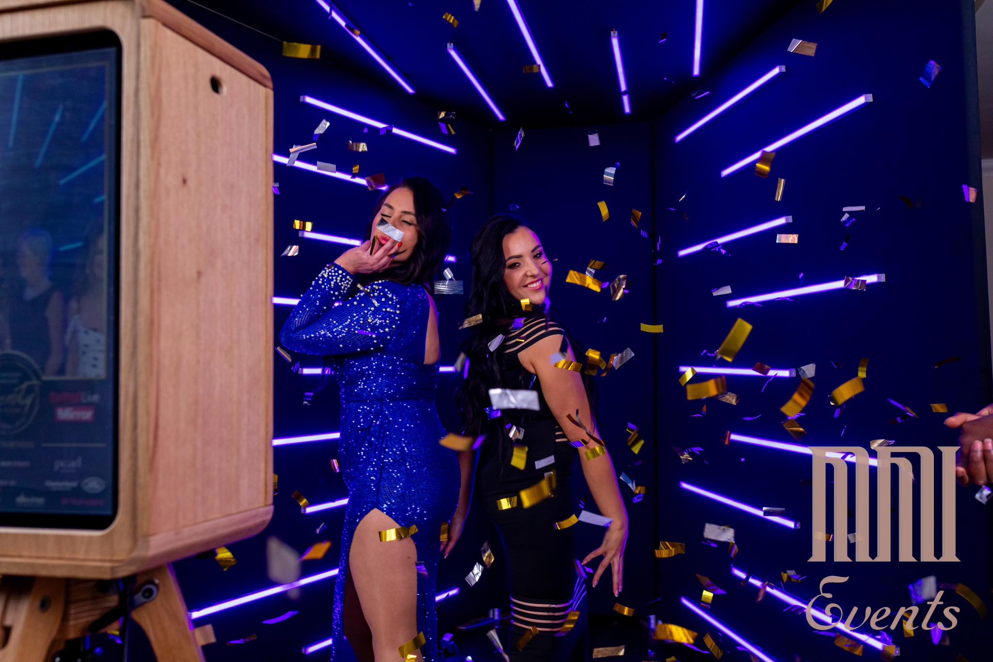
Image + bottom navy gradient, 24px radius.
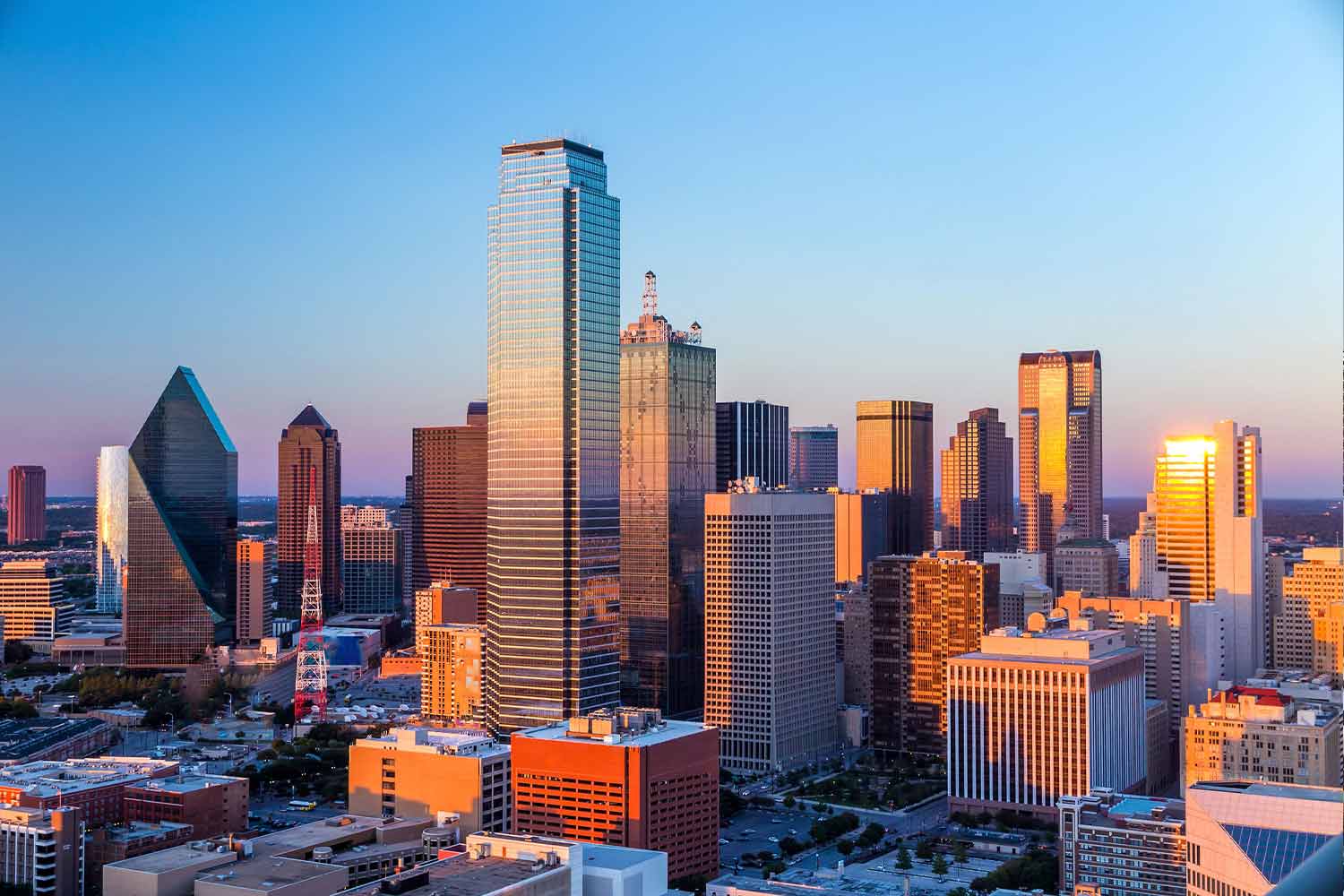
4:3 image, content below, no shadow.
Navigation
Items 0.78rem / 500 / 0.14em, 80% white; hover & active turn coral. CTA is a square coral outline that fills on hover.
Labels
All labels use .text-eyebrow: 0.72rem, 600, 0.22em, uppercase.
06 — Spacing
An 4px-based Tailwind scale; sections step up from mobile to desktop.
Container width
max-w-[1280px], centered
1280pxContainer gutter
px-5 mobile, md:px-10 tablet+
20px → 40pxSection padding
py-16 mobile, md:py-24 desktop
64px → 96pxCompact section
py-14 / md:py-20
56px → 80pxCard padding
p-7 / p-8
28px – 32pxGrid gap
gap-5 / gap-6
20px – 24pxButton padding
px-8 py-4
16px 32pxContent spacing
mt-3, mt-4, mt-6 between text blocks
12px / 16px / 24px07 — Radius
Feature panels
32pxCards & images
24px – 28pxIcon tiles
16pxInputs / small UI
4pxButtons, pills, badges
9999px08 — Imagery
Real event photography only. Images sit inside rounded, bordered frames; text over images always gets a navy gradient for contrast.
Radius
24px cards · 32px feature panels
Overlay
linear-gradient(to top, #0E1523 10%, transparent 75%)
Aspect ratios
4:3 cards · 3:4 portraits · 16:9 features
09 — Responsive
Mobile
< 768pxSingle column, 20px gutters, hamburger menu, smallest type.
Tablet
768px – 1023pxmd: 2-column grids, 40px gutters, intermediate type.
Desktop
≥ 1024pxlg: full navigation, 3–4 column grids, largest type.
Wide
≥ 1280pxxl: container caps at 1280px.
10 — Divi
Copy-ready values for rebuilding in WordPress + Divi (Theme Customizer → Global Colors / Fonts, and module Design tabs).
Global colors
#0E1523#16233B#202B3F#F9FAFB#B2B7C1#DFAE9D#8E523A#C9B37E#E8E3DD#FFFFFF1FTypography (desktop / tablet / mobile)
64px / 38.4px / 35.2px · 80089.3px / 47.6px / 41.6px · 60056px / 32px / 32px · 60028.8px / 21.6px / 21.6px · 60021.6px / 18.4px / 18.4px · 60019.2px / 16.8px / 16.8px · 60015.8px / 15.2px / 15.2px · 70018px / 16px / 16px · 40017px / 15.7px / 15.7px · 40014.4px / 14px / 14px · 40012.5px / 11.5px / 11.5px · 50012.5px / 11.5px / 11.5px · 70011.5px / 10.6px / 10.6px · 600Buttons
Archivo12.5px / 7000.16em16px 32px100px#DFAE9D#0E1523Layout
1280px40px / 40px / 20px96px / 96px / 64px24px32px / 28px768px / 1024px / 1280px